CSS Grid◿
Blog post
Please note: this blog post was written in 2017 so some information may be outdated.
Aim
To gain a deeper understanding of CSS Grid and to understand when it should be used.
Objectives
- Work out whether to use flexbox or grid. Or both?
- To develop working prototypes of CSS Grid.
- To apply CSS grid to aspects of my personal site.
Css celebrated its 20th birthday in 2017 and it's amazing to see how far it has come since then. Luckily for me, I wasn't working on websites when "developers used to have to fake the appearance of layouts" (Andrew, 2017). These developers used to have to master floats, tables, and columns to somehow force their designs together.
After years of improvements to CSS, it has become easier than ever to design our HTML structured pages through flexbox and, most recently, CSS Grid. "Flexbox and Grid are the perfect CSS layout solutions — the modern standards. If you must write CSS at a reasonable level, then investing in a Flexbox and Grid education is priceless" (Emmanuel, 2017:online).
So, what is CSS Grid?
CSS Grid can describe the layout of an entire page in CSS for the first time ever by using a grid system. It's now time to take advantage of this pivotal moment in the evolution of CSS layout.
What about flexbox? Isn't that good enough?
Yes, flexbox does a great job and will still be used just as often. However, flexbox offers a one-dimensional layout, whereas grid offers two. Crazy, right?
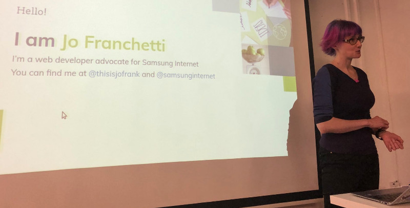
I was able to attend a McrFRED meetup in January 2018 where Jo Franchetti (Figure 1) had done a talk on CSS grid. One of the main things I remember Jo saying was that "we should not forget about the other technologies, as flexbox, for example, is still the best way to center-align anything" (Franchetti, 2012:presentation).

Jo Franchetti giving a talk on CSS grid
Just because a new web technology is starting to become widely used doesn't mean your favourite technology is going away anytime soon, so don't worry avid flexbox users. Flexbox isn't going anywhere...
See the Pen Flexbox example by Sam Bindloss (@bindloss) on CodePen.
My first attempt with CSS Grid
After I read through Rachel Andrew's book (The new CSS layout) I was surprised as to how easy it was to quickly pick up and implement grid to create quick, basic layouts. The codepen below shows an example of what I could quickly put together thanks to using grid.
See the Pen First play around with grid by Sam Bindloss (@bindloss) on CodePen.
After understanding the basics, from setting the grid-template-columns to spanning blocks over different rows and columns, I could instantly see the potential. So I thought, why not make something fun with this new technology?
Treading into unknown territory
The codepen below is just showing off the ability of CSS grid but doesn't have much purpose. Imagine trying to create something like this with floats or flexbox?
See the Pen Fun with CSS Grid by Sam Bindloss (@bindloss) on CodePen.
This example involved adding a black background colour to all of the empty divs. It contains 8 columns with the furthest left and right columns using only 1fr of the space while the 6 columns in the middle take up the remaining amount of space while also being 3x wider. The rest of the work that needed to be done was to 'creatively' show off transparent blocks that would reveal the background image.
This was very easy to do, as all I had to do was target the divs that were situated above the parts of the image I wanted to show, give it a transparent background colour and span it across columns or vertically with rows. You can view the code here: Codepen example.
All of these things are great... But what about browser support?
As of writing this in March 2018, browser support is starting to look pretty good for CSS grid. With a few exceptions, (Opera mini and old versions of Chrome and Safari) grid is now able to establish itself as the go-to technology for creating grid-based layouts. See figure 2 for a table displaying the browser support for grid.

Table displaying the current browser support for CSS Grid
Time to use grid for something useful
I'm always looking to improve my personal profile. Whenever I learn something new with CSS and JavaScript, I instantly want to go back and change my whole site and make it better. Recently, I have been unimpressed with my current layout for my collection of blog posts, so I thought "Why not use grid to switch up the layout?"
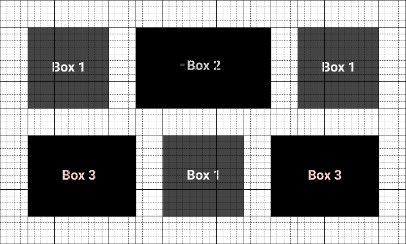
Planning in photoshop
Before I started getting stuck into the code, I knew I could play around with a few ideas for layouts before I started coding. This would have saved me a lot of time and gave me structured guidelines to follow for when I started to implement the code (Figure 3).

Photoshop mockup for the layout of the new blog page
Coding time
The plan was to have a grid layout for screens larger than 767 pixels (768 pixel is the width of an iPad) and to have a single column layout anything below that width. The approach I took was to use display:grid for anything above the 767px benchmark and used flex-direction:column with a media query for anything below that width.
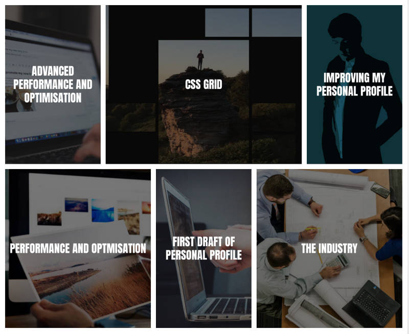
Desktop improvements (Figure 4)

New and improved grid layout for blog page on desktop
Evaluation
So if this blog post hasn't persuaded you enough and you're still on the fence about applying it to your work, then just know this: "Applying new technologies helps the industry embrace newer and better formats. It helps us grow as a community. A community we so love, and want to grow" (Emmanuel, 2017:online).
References
Andrew, R. (2017) The new CSS layout. New York: A Book Apart.
Emmanuel, 0. (2017) How To Approach CSS layouts in 2017 — and beyond. Medium. [Online] [Accessed on 13th March 2018] https://medium.com/flexbox-and-grids/css-flexbox-grid-layout-how-to-approach-css-layouts-in-2017-and-beyond-685deef03e6c
Emmanuel, O. (2017) Should you learn the CSS Grid or not? Medium. [Online] [Accessed on 16th March 2018] https://medium.com/flexbox-and-grids/should-you-learn-the-css-grid-or-not-3e8c93a3619b
Franchetti, J. (2018) Jo Franchetti on CSS grid. Presentation at SpacePortx, Manchester, 25th January.